
Symbolizing recovery: analyzing COVID-19 graphics and dashboards
Michael Simeone, ASU Libraries
“Done well, data visualization can help communicate risk, demonstrate the impact of collective action, and inform decisions to produce an equitable and resilient society.”
- Michael Simeone, KER Fellow 2020
Background
In the year 2020, we are awash in graphics that attempt to explain and visualize the COVID-19 pandemic. Since the pandemic has taken hold in the United States, there has been a renaissance of maps, charts, and dashboards created by major media outlets, state health departments, and scientists. For better or worse, these visuals inform decision-making at every scale, as individuals, organizations and governments attempt to mitigate risk and facilitate recovery from this shock. With data about the virus a daily part of life, what can we learn about the role and circulation of data visualizations during a crisis?
Research questions
-
What were some of the patterns demonstrated across some of the most popular data graphics during COVID-19?
-
How might we extract principles from these and other examples when trying to learn what data graphics for resilience might need to look like?

Methods and findings
Simeone’s project had three major threads of activity: an image analysis of graphics collected from Twitter, a survey of COVID-19 graphics produced by major media outlets, and a review of all 50 states’ COVID-19 dashboards. Remarkably, tweets with the hashtag #flattenthecurve contained fewer images on average than a random selection of #covid19 tweets, and it contained fewer statistical graphics as well. “The Curve” circulated as a trope of the impact of behavior change on a complex phenomenon spanning biological, social, governmental, and technological factors; the idea was more durable than any chart. This is further demonstrated by the generations of charts that gained and then lost popularity in short bursts of time; the graphical representation of COVID-19 on this hashtag was subject to constant revision and updating.
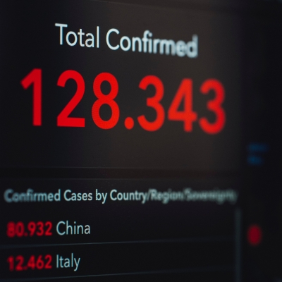
Furthermore, the survey of media and state resources showed that maps were a mainstay of visualizing covid trends, even if there wasn’t a clearly spatial aspect of the epidemic. For instance, although no websites surveyed explicitly indicated that geographic proximities of one county to another or one state to another may elevate the risk of transferring COVID-19 across borders, nearly every site we looked at used state and county level maps to show the distribution of cases. Ultimately, maps and trendlines abound in the data collected from every source, but these visualizations and accompanying summary statistics did little to speak to the needs and decisions made by laypersons on a daily basis. These habits of visualizing the pandemic inadvertently make the profoundly large numbers associated with the pandemic more abstract and less associated with the consequences of policy or collective behavior.
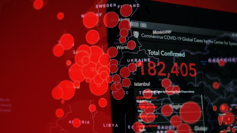
Simeone found that many news outlets and government bodies produced bubble maps like this one, which didn't provide useful information for decision-making.

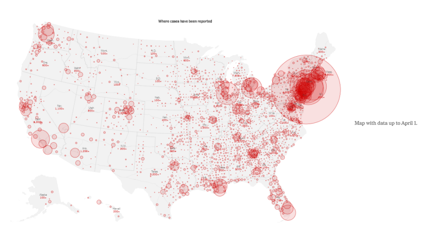
Even the New York Times relied on bubble maps like this one, which tended to obscure more information than they revealed.
Partners
-
Shawn Walker, School for Social and Behavioral Sciences, ASU West
-
Gracie Valdez, Watts College of Public Affairs, ASU
-
Tanush Vinay, School of Computing, Informatics, and Decision Systems Engineering, ASU
-
Pauras Jadhav, School of Computing, Informatics, and Decision Systems Engineering, ASU
Impact
This research provides a better understanding of collective mores of data visualization in crisis, giving us an unparalleled perspective on tendencies for risk communication, as well as opportunities for improvement. How we visualize harm, risk, and the consequences of collective decisions is a critical part of adaptation and resilience. Data visualization allows for new decision making and helps viewers sort through data that would be impossible to approach without externalizing through visuals. Employed deliberately and with the full knowledge of what does and does not work is an important way to make sure that complex data can matter to decision makers.
Simeone hopes to better inform audiences so they can be more deliberate in what they recognize and take away from data visualizations about the pandemic. In the long term, he hopes that his work will influence future practices in visualizing data from disasters and other widespread threats to public health.
Deliverables
Learn more about this project by reading Simeone's feature in Slate and listening to his episode of the Misinfo Weekly podcast, below. You can also check out his guide documents on best practices for data visualization during a public health crisis.
Simeone also submitted his findings to a special issue of International Communication Association and created an open-source document that further develops his team's observations and recommendations.
Michael Simeone

Associate Research Professor
ASU Biosocial Complexity Initiative
Knowledge Enterprise Scholar, 2022–2024; Crosscutting Scholar, 2018–2022; Academic Fellow, 2020
Michael Simeone is a researcher interested in multidisciplinary data science.
He currently serves as the director of Data Science and Analytics for ASU Libraries at Arizona State University. He was the founding director of the Nexus Lab for Transdisciplinary Informatics at ASU from 2013-2016. He is also affiliated with the Chainbuilder decision support systems group, as well as the Innovative Software and Data Analysis Division at the National Center for Supercomputing Applications.
His research includes multidisciplinary data science, post-cybernetic culture and technology, analysis of human-technology networks, data visualization, and data-driven collaborations that bridge environmental sciences and humanities.
Currently, he serves as a Domain Champion for Humanities for the Extreme Science and Engineering Discovery Environment. He received his doctorate in English from the University of Illinois at Urbana-Champaign.