Data Dashboards and Tools
Accessible analytics and interactive visualizations to empower informed action
We work with community partners to develop anticipatory models, dashboards, visualizations, apps and predictive data tools that help change agents and decision makers gain the insights they need to tackle our most pressing challenges.

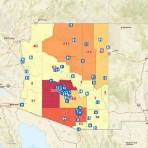
Arizona Eviction and Foreclosure Dashboard

Knowledge Alliances Tool
University-Community partnerships can be highly beneficial to both parties through the sharing of critical empirical knowledge and cutting-edge scientific research. These partnerships can be difficult to facilitate.
Researchers at Arizona State University have developed the novel Knowledge Alliances Tool, which provides a search interface that enables users to search for potential partners based on similarities in shared work topic interests.
It's a platform to facilitate the formation of University-Community partnerships.

Discoveries and Solutions at the Intersection of Heat, Health, and Housing

Tree Data Inventory Exploration Tool
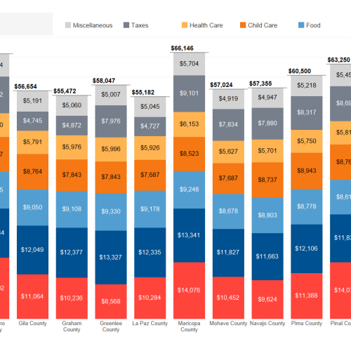
HEIGHT Poverty Dashboard

Maricopa County Evictions Dashboard

Smart City Metrics Visualization

Visualization: Temperatures in Maricopa County
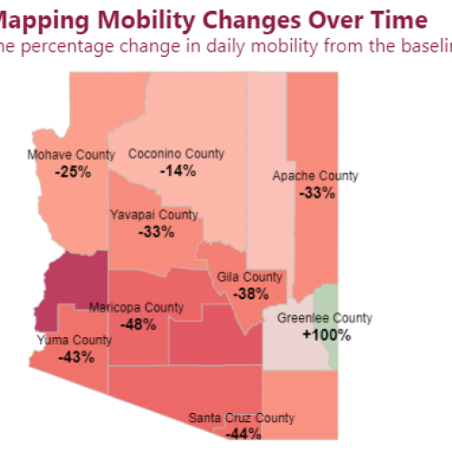
Disruption in Mobility due to COVID-19 in Arizona